a look into our process
Navigating licensing
Packaging Design, Strategy, Account Management
sharpening your toolkit
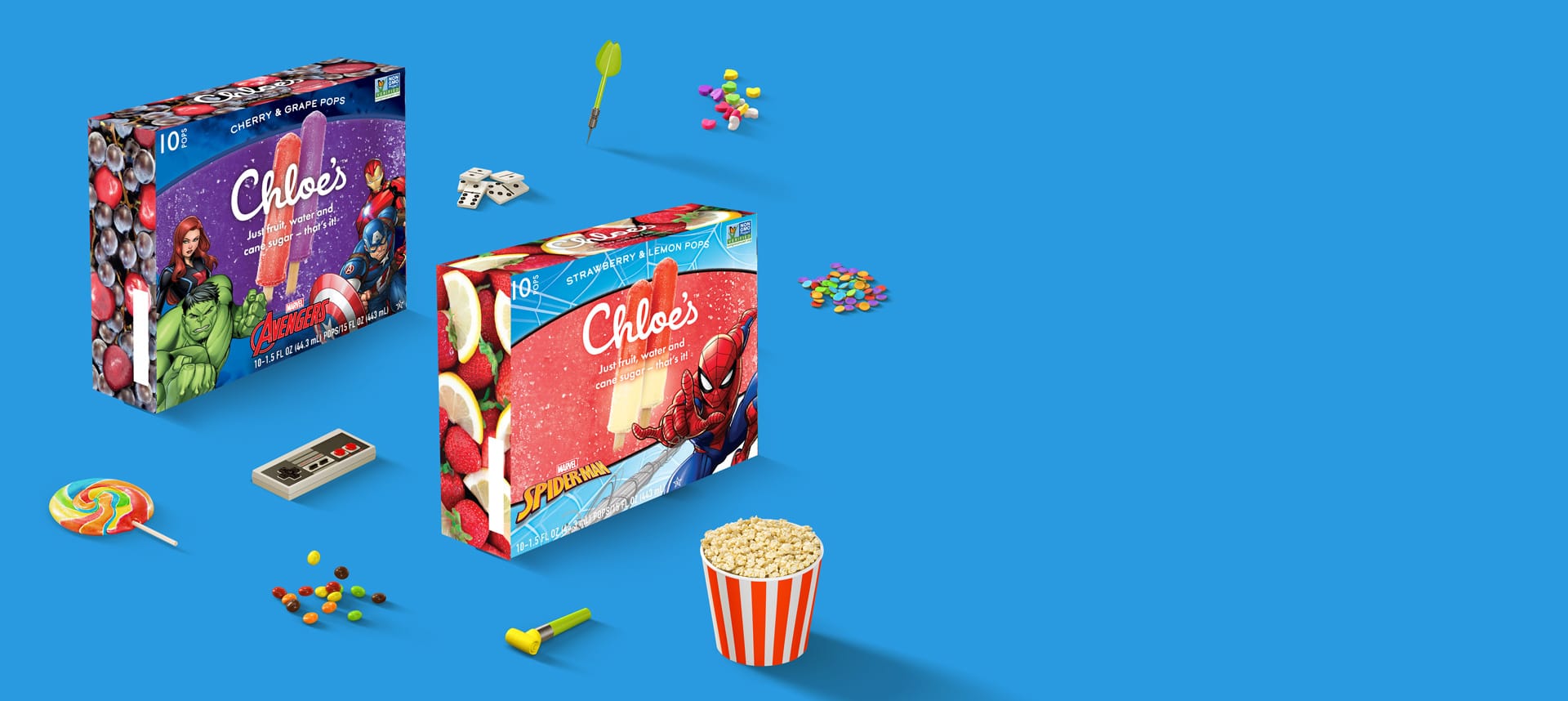
How do you nail your first major licensing project on a super aggressive deadline? We found out last year when we partnered with Chloe’s Fruit to do their packaging design for Marvel© and Zumba. Check out our process for some tricks we learned and tips for keeping everyone happy.
First, some background. Licensing helps brands stay relevant and emerge in new territories and demographics. Licensing is a $270 billion-plus industry, with Disney being top licensor in the world in 2018 with $54.7 billion in retail sales of licensed merchandise worldwide. Within the kids market alone, licensed character art can generate a handsome profit for CPG brands. So, licensing skills are a great tool to have as a studio, because you’re likely to run into clients that do at least some licensing.
There is a delicate balance when working on a licensing project. You have your client’s goals, interests, and their brand vision, but you also need to play by the licensing rules (which, surprise, don’t always match up!). Licensing rules can be substantial and a dedicated account manager is helpful in spending the time to suss out all of the details before you get started.
Five Things To Consider When Working On A Licensing Project
- What are the client’s goals, objectives, and needs?
- What are the licensee rules? Are there brand guides that have usage rules, logos, colors, font guides?
- What are the co-branded rules (if any)? Does the licensee require the main focus and dominance of the packaging? If so, how does that play into your client’s goals?
- Who is your dedicated account person? This person can facilitate feedback to move the project and process forward.
- What are the approval processes? Does every party need to see physical proofs in hand at every phase of development? Will the manufacturers require printed proofs with signatures? If so, pad in a few extra weeks of approval time.
Our Process
We started with a loose concept and were able to paint broad strokes and develop a baseline graphic direction quickly.
Understanding logo hierarchy and co-branded rules were crucial at the outset of the project. Fortunately, Chloe’s had a history of licensing with Nickolodeon and their established product architecture. For Chloe’s, we knew that we needed to retain the: logo, tagline, pops image, and a section for the founder’s story. Additionally, we had a firm grasp of the brand colors, and minimum font size and specific language.
From there, Marvel© had a plethora of assets available to us. We found character art that was diverse in usage and application for our design needs and our client’s goals and objectives. We had a blast throughout this process; having highly detailed and quality art at our fingertips to play with was an excellent experience.
The Marvel© licensing team answered all of our questions and provided feedback on font usage, logo minimums and suggested maximum sizes. They were very detailed in providing information on character proportions in relation to each other, clear space with no interference to the character art, and suggested alternate poses.
Pictured some of the character art available to us; an initial design to the final box. It was a challenge to understand all the rules of each character, and to gain a sense of scale and significance when working within the Marvel© Universe. Fortunately, we had a great contact person at Marvel© to guide us through this process.
Achieving our
Client's Goals
At the outset of the project, the Chloe’s team knew they didn’t want the licensing art to dominate the box. They wanted the characters to pop out of the box and feel three dimensional and dynamic–but also balance with their brand and the pop image. Additionally, they wanted space to reference the other Marvel© project.
We ultimately framed out the art with the licensed characters and achieved the 3D look. This balanced the pops and brand info, giving both identities visibility with clear and defined placement on the box. The near 50/50 split fit Chloe’s and Marvel’s© requirements, rules, and goals.
We felt the fruit and clean ingredients were still relevant and photographed the natural ingredients for the side panels. This followed Chloe’s product and brand identity–with each flavor having an eye-catching fruit image.
We completed this project in just over two months! Many thanks to the Marvel© licensing team who made the process very smooth for us licensing newbies. The project was a success with leading grocers interested in the new pops for immediate launch. But that’s not all we accomplished for the Chloe’s team this past year. Check out our portfolio page for more work, and follow along our blog series about the milestones of our retainer relationship with Chloe’s Fruit.