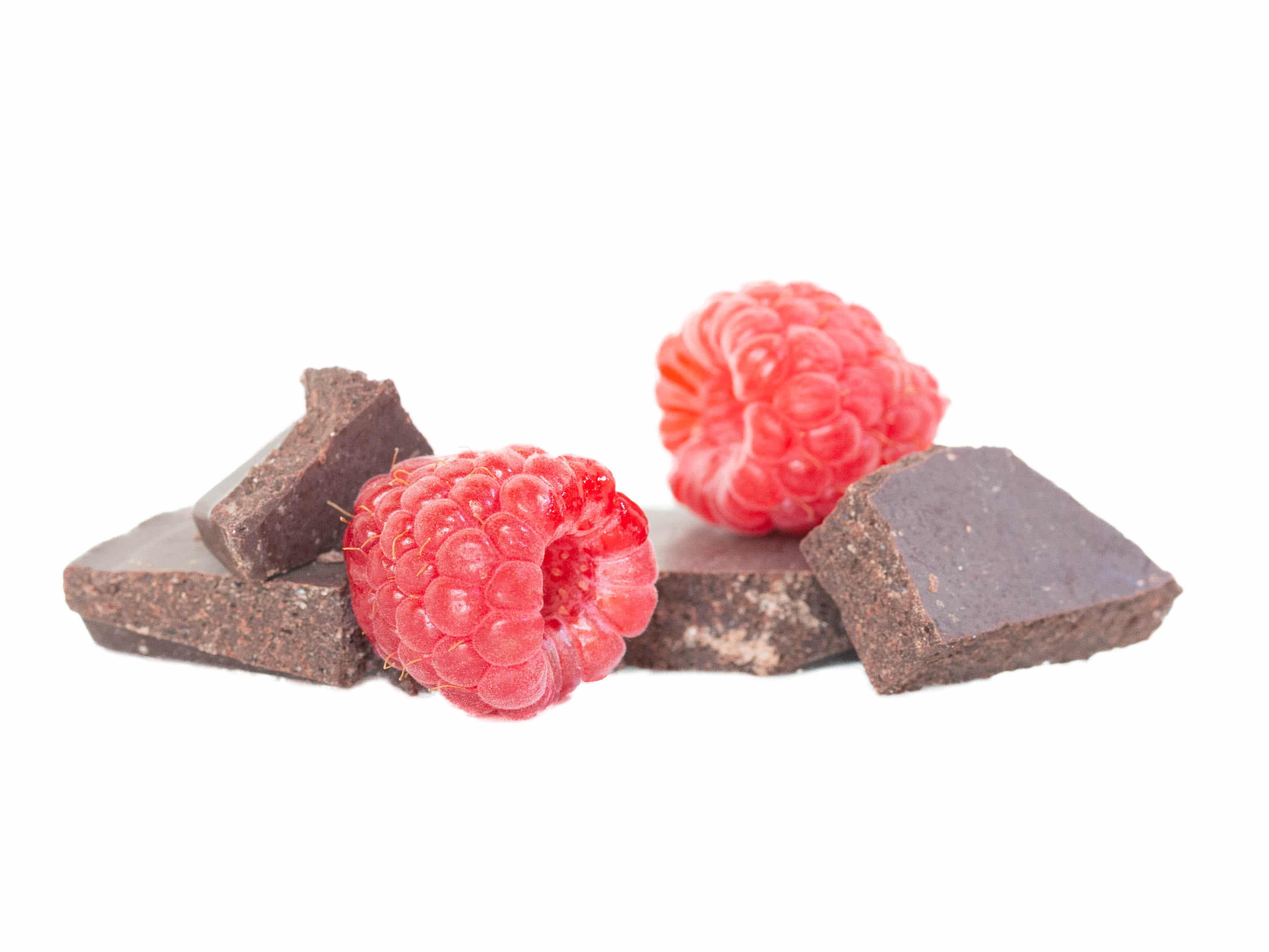
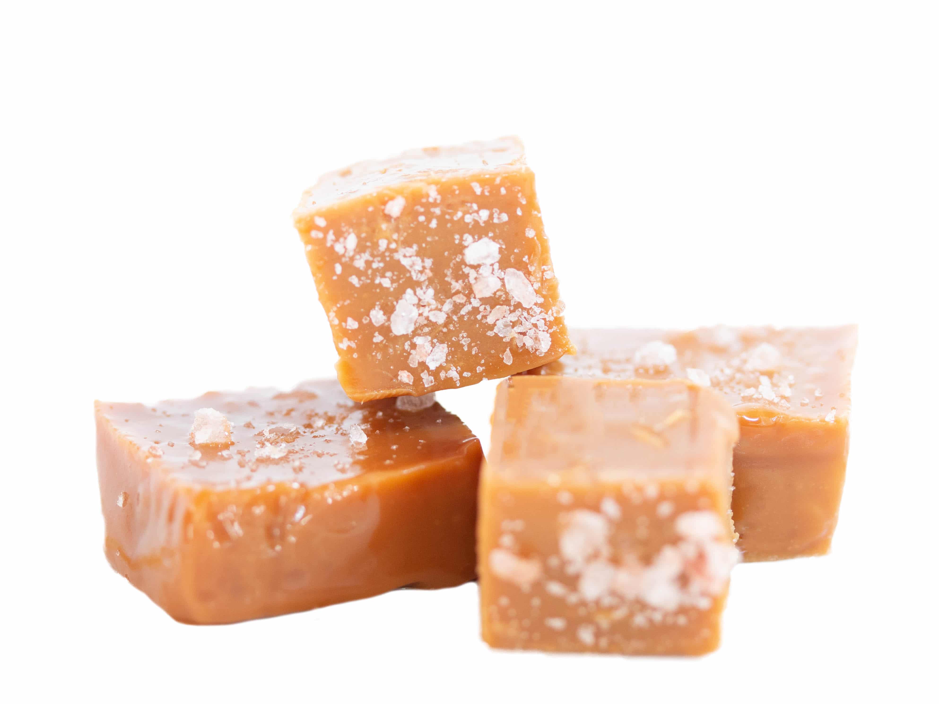
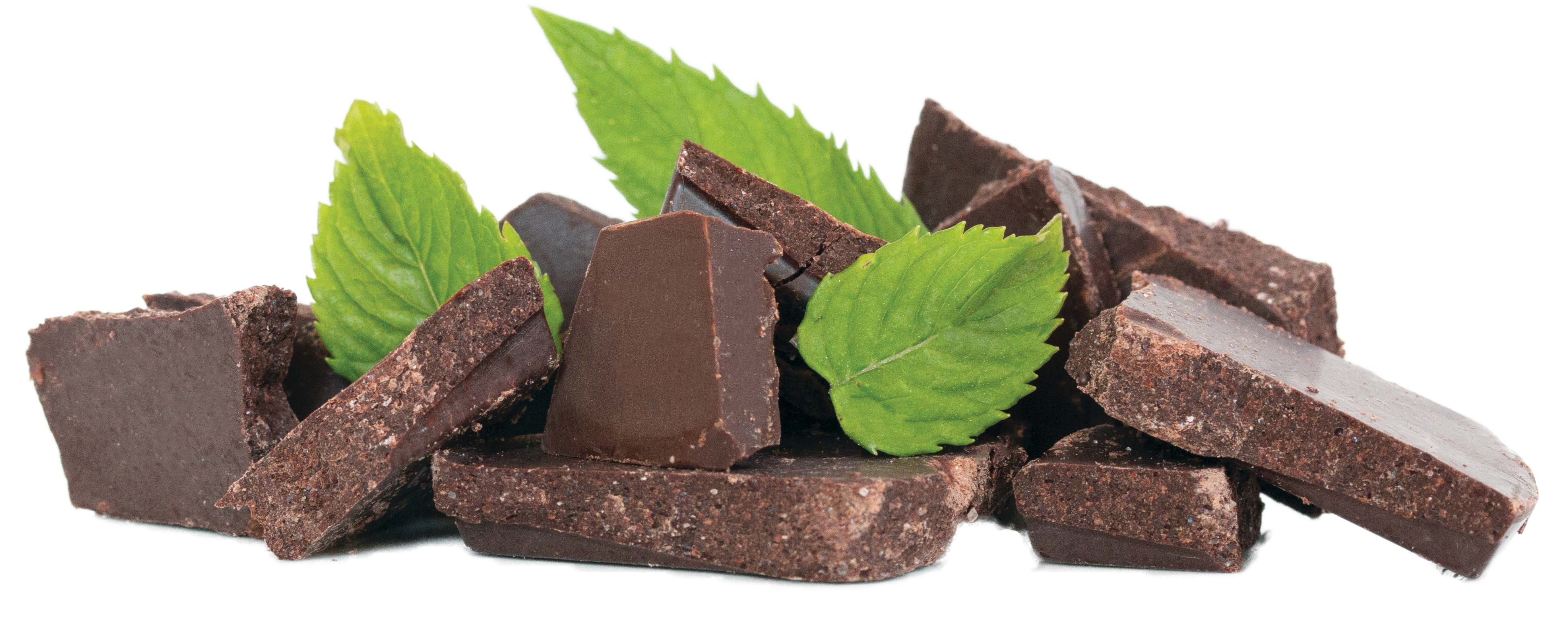
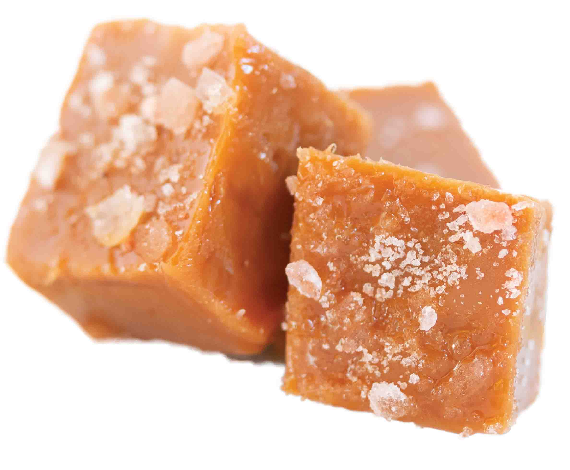
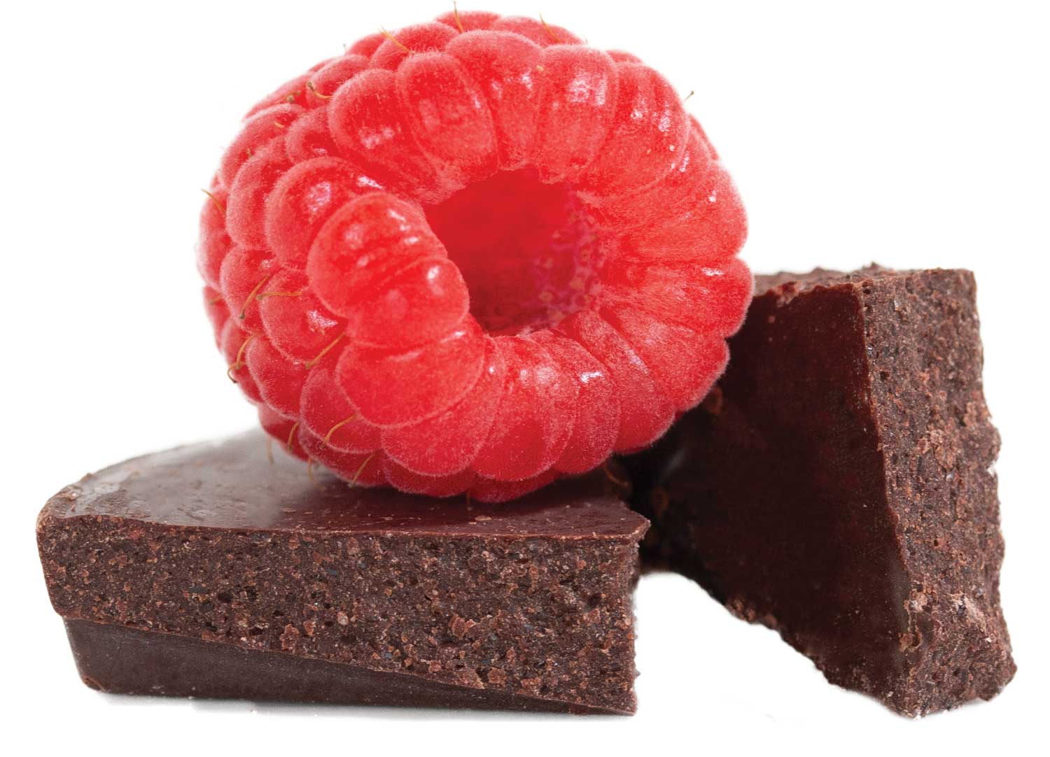
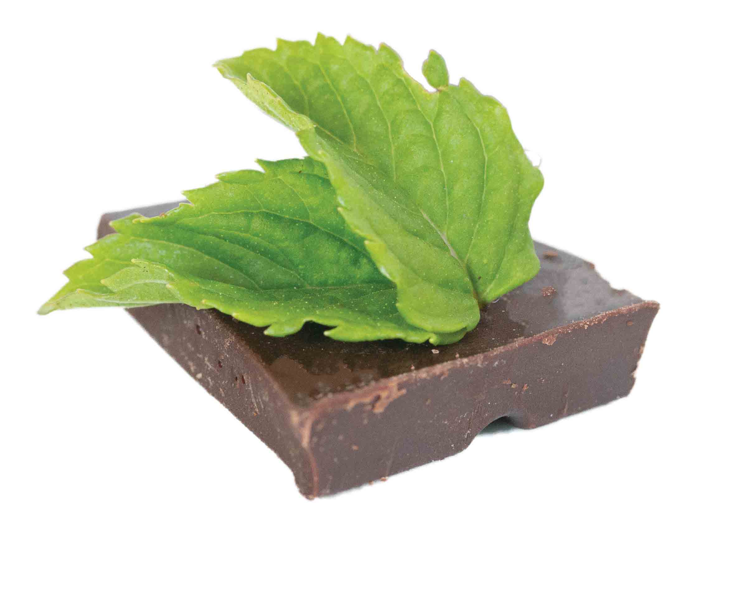
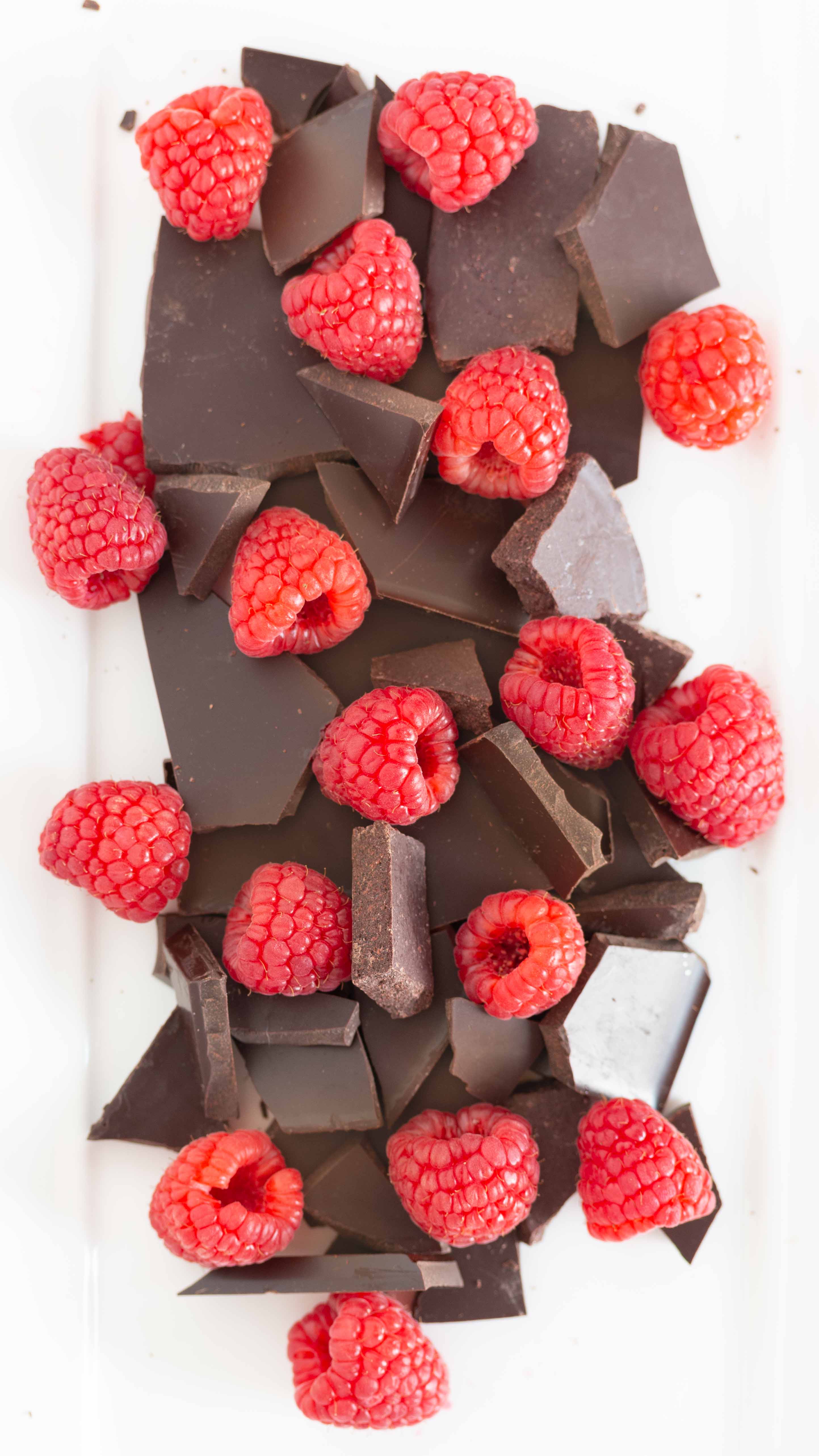
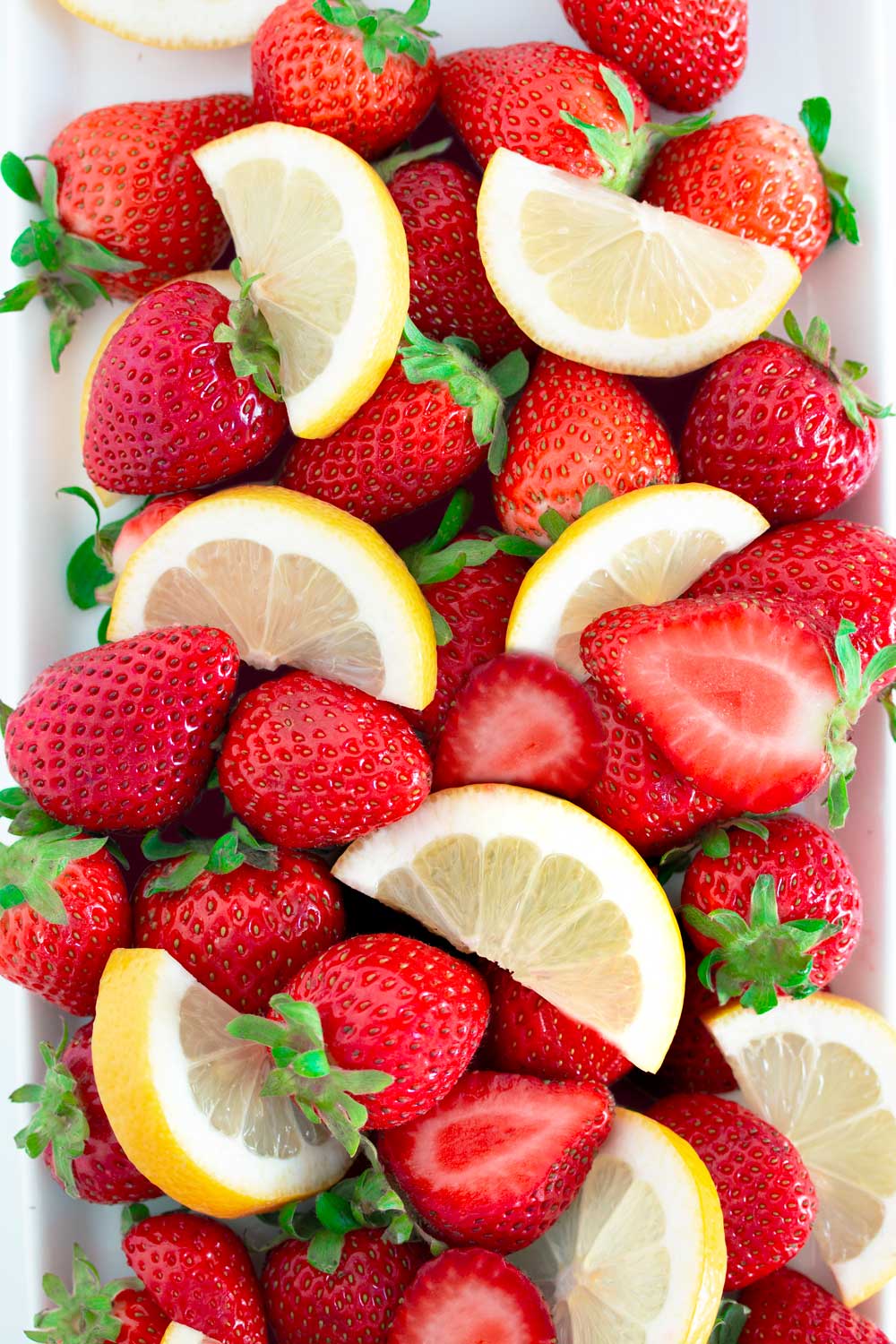
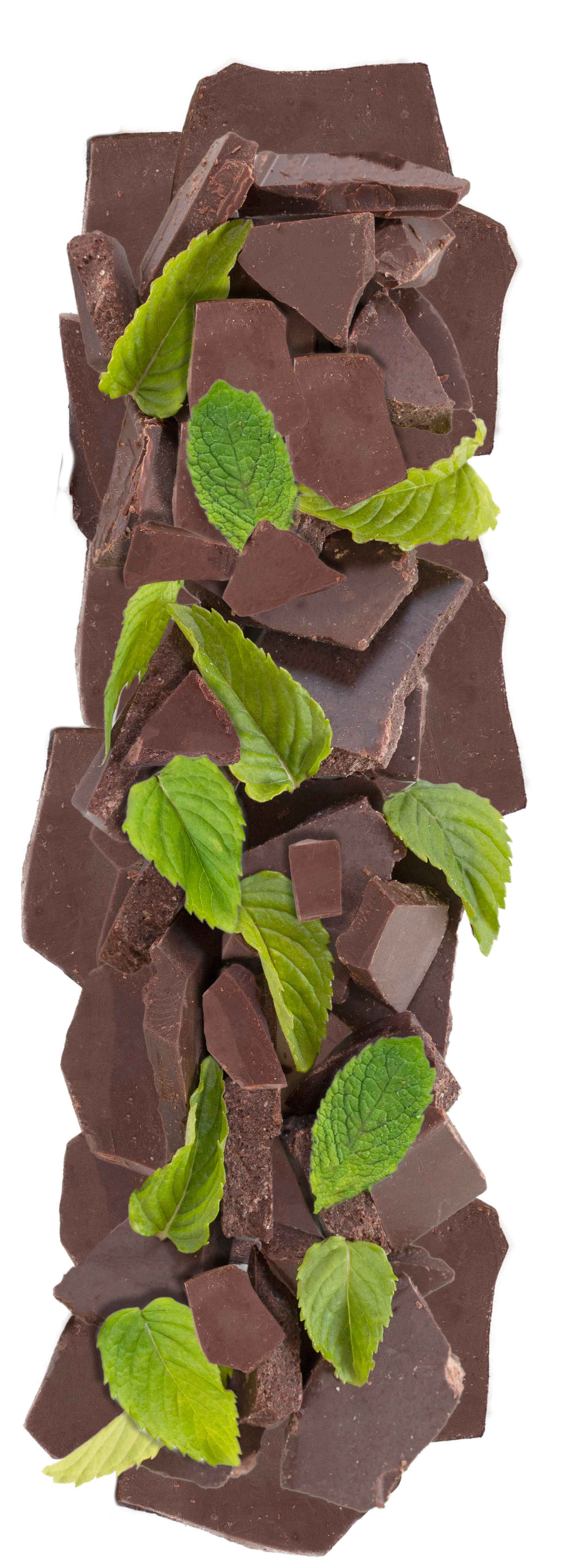
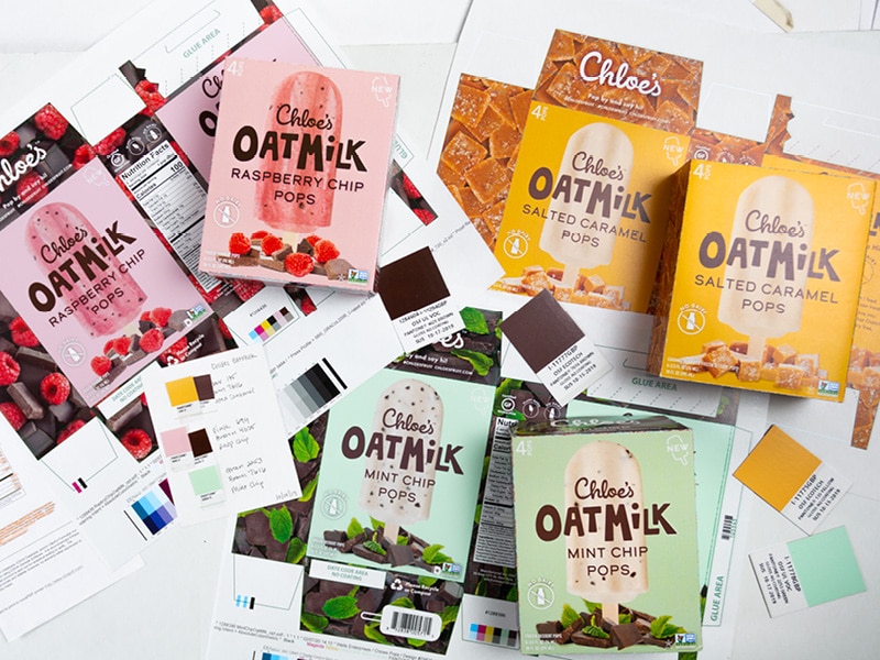
We were contracted to design eight SKUs for Chloe’s Fruit, including a new Oatmilk sub-brand. Their existing product line highlighted real photography of their clean ingredients as a significant part of their visual language. It was critical for us to maintain that visual language as we worked to complete all of the deliverables. We photographed several ingredients pairings from every angle, to maximize their versatility throughout the packaging designs. Our approach with packaging design relies on creating high-quality assets for client needs, with specific placement and goals in mind.
Final Art
The Results
This resulted in a giant library of high-quality assets versatile for the project goals, packaging deliverables, and beyond. The decadent ingredients photographed for the Oatmilk line completed the front design with the elements grounding the pop image while highlighting the delicious ingredients. The image assets went the distance for the versatility in usage from packaging to the trade show booth graphics for the debut of this product line at Natural Foods Expo West.