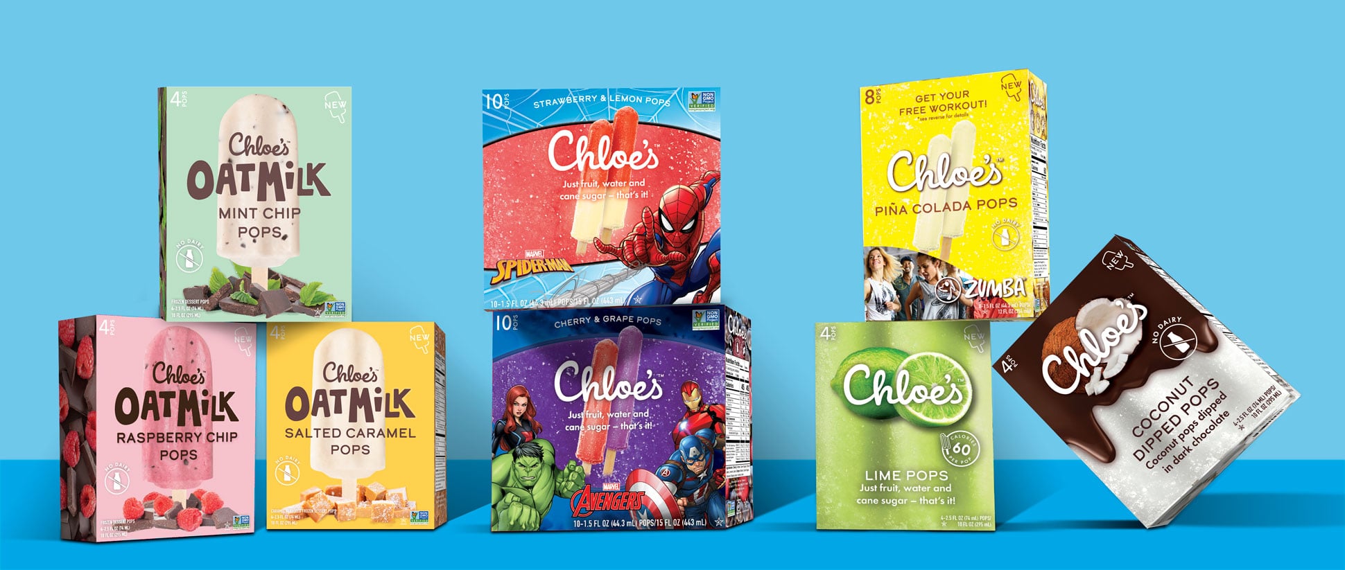
Our collaboration with Chloe’s Fruit spans 3.5 fruitful years, during which we pioneered innovative designs for their groundbreaking products, including the Oatmilk Pops, Zumba line, and beloved Marvel Avengers and Spider-Man kid’s pops. With Chloe’s Fruit enjoying a national presence across 10,000 stores and international recognition in the UK, our challenge lay in harmonizing their diverse product offerings under a cohesive brand identity.
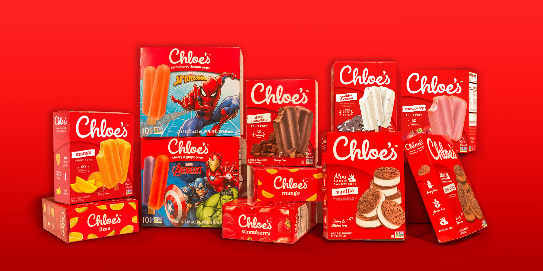
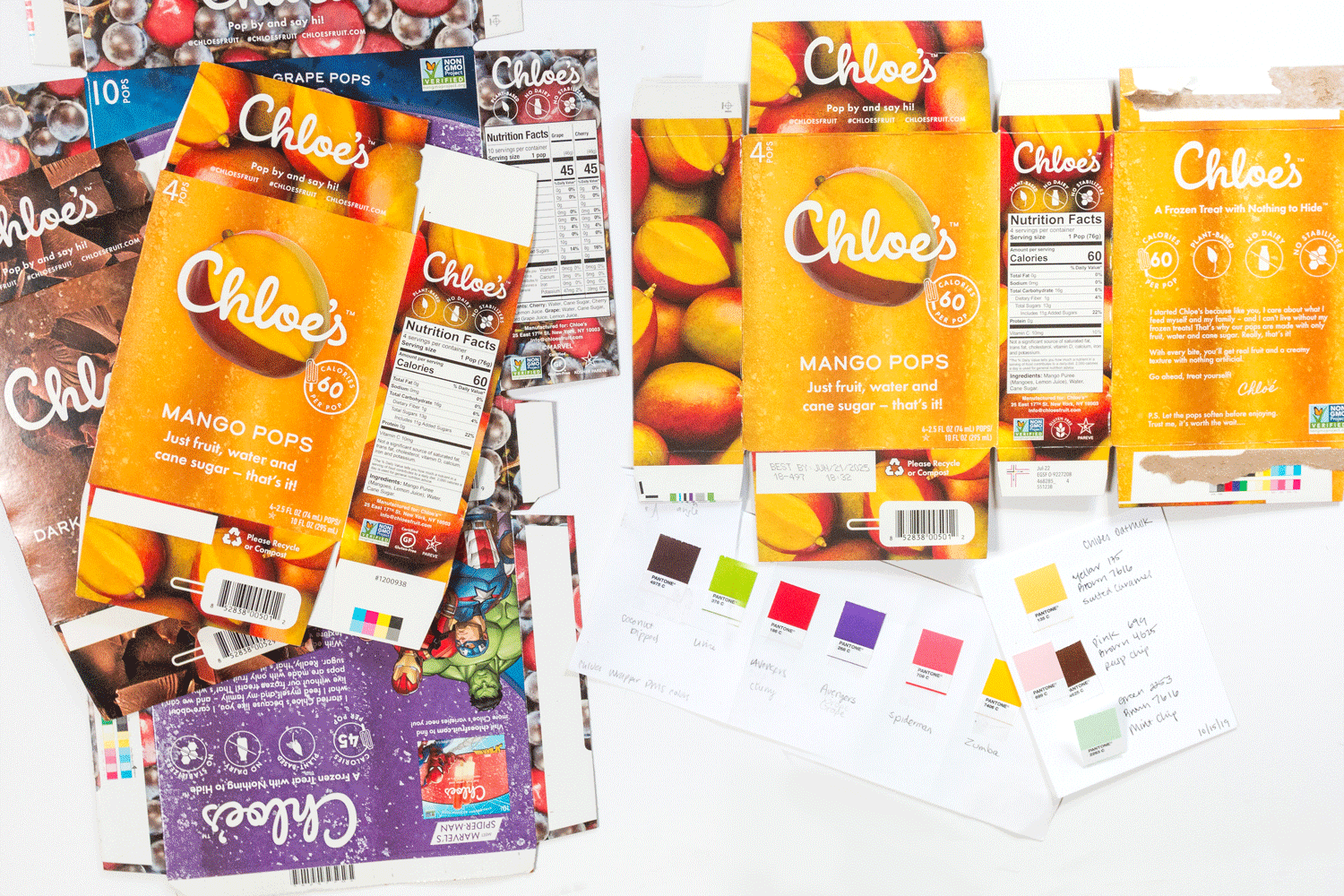
Previously designed packaging from 2019.
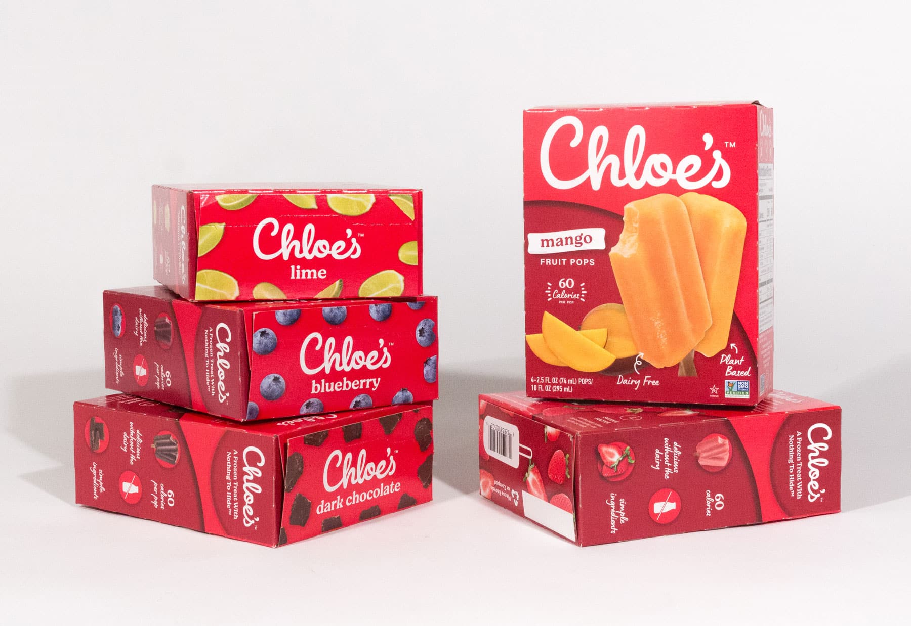
Strategy
In an increasingly competitive freezer aisle landscape, characterized by fleeting design trends, we prioritized longevity and brand recognition. After meticulous design exploration, we unveiled a tonal red-on-red concept, saturated with warmth and nostalgic appeal, complemented by approachable typefaces.
process
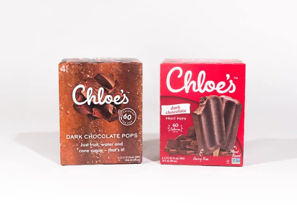
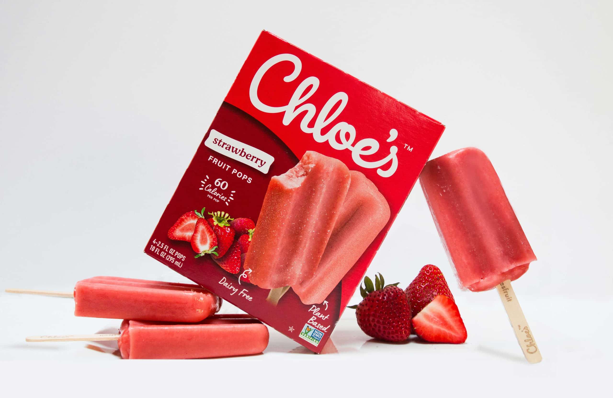
Through a thoughtful blend of color blocking and captivating photography, our design exudes a delightful yet sophisticated feeling synonymous with the Chloe’s Fruit brand. To elevate the appetite appeal and showcase the deliciousness of each flavor, we meticulously photographed every Chloe’s Fruit variant alongside its fresh ingredients.